Google Travel (2019)
Advancing the Google Travel product by unpacking the unique cultural norms in Japan
My Role: Executive Design Director and Program Lead
THE TRAVEL TEAM had noticed that the Japanese market was an outlier in terms of HOTEL BOOKING usage and they had the idea that we could use the market as a “lab” where insights collected from this outlier market could point to valuable opportunities to evolve the product for the global market.
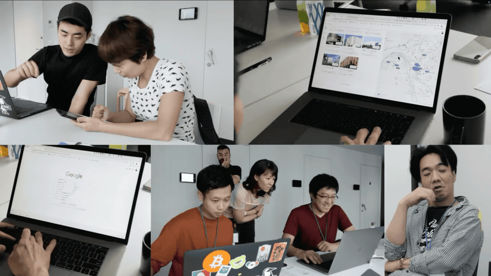
My role was leading the UX team, a mix of interaction designers, researchers, and visual designers. We were all based in Japan for this work.
Let’s begin with some context—the landscape of digital interfaces in Japan.
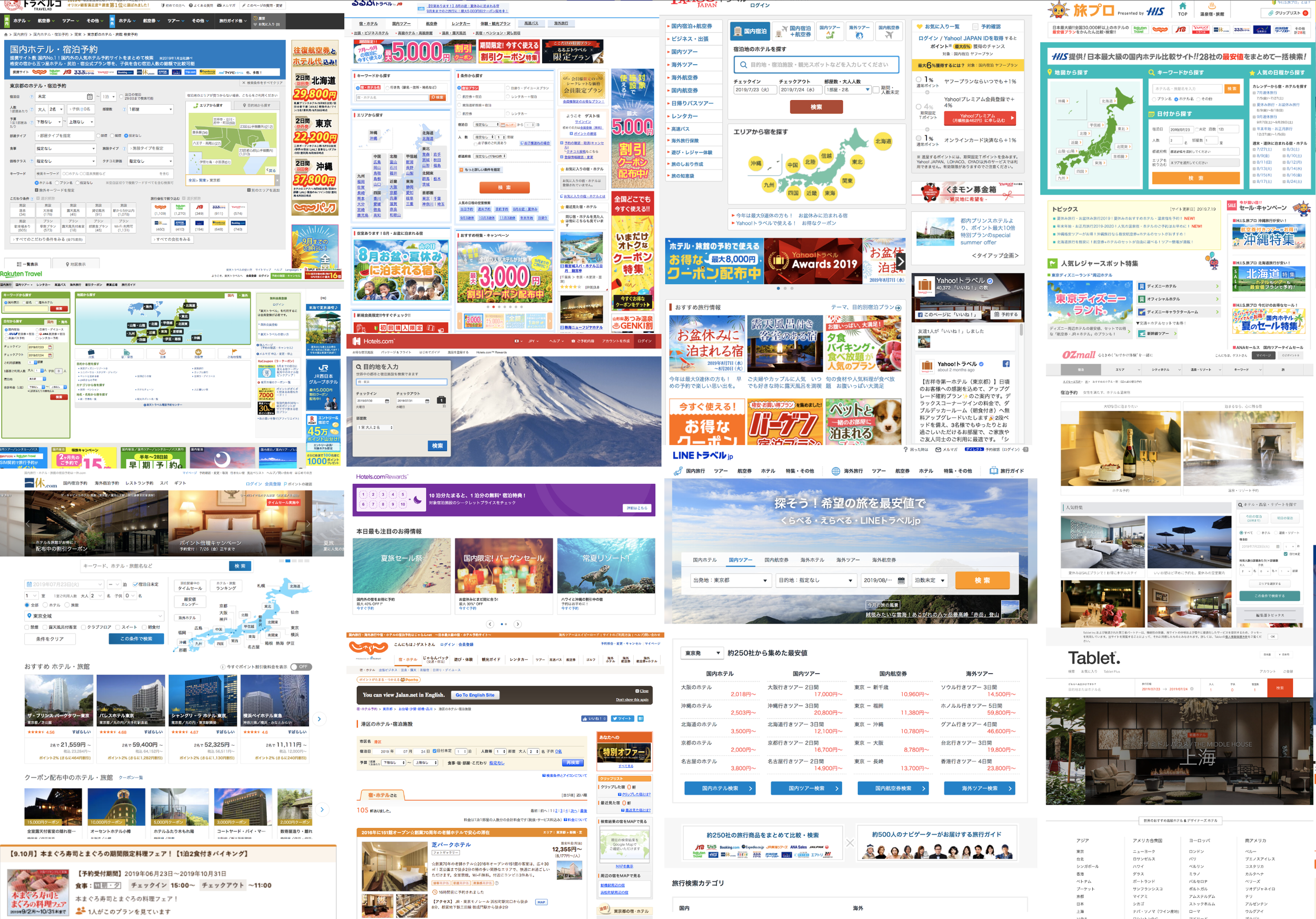
This is what online hotel booking looks like in Japan: Dense UI, complicated travel packages, and choices beyond measure. Google receives more than 90% travel-related queries but less than 10% click through to travel properties. On the surface, users in Japan apparently just prefer using local travel sites.
Our hypothesis was that something was driving this from a cultural perspective and we might uncover new opportunities if we could unlock some of that—what’s not being said outright. The UX here for Japanese Online Travel Agencies answer a need, but that doesn’t mean it has to be Google’s answer. If we can understand the needs driving why these products are what they are in terms of UX, Google can design for them, but in Googly ways. Before creating the ‘what’, we had to figure out the ‘why’.
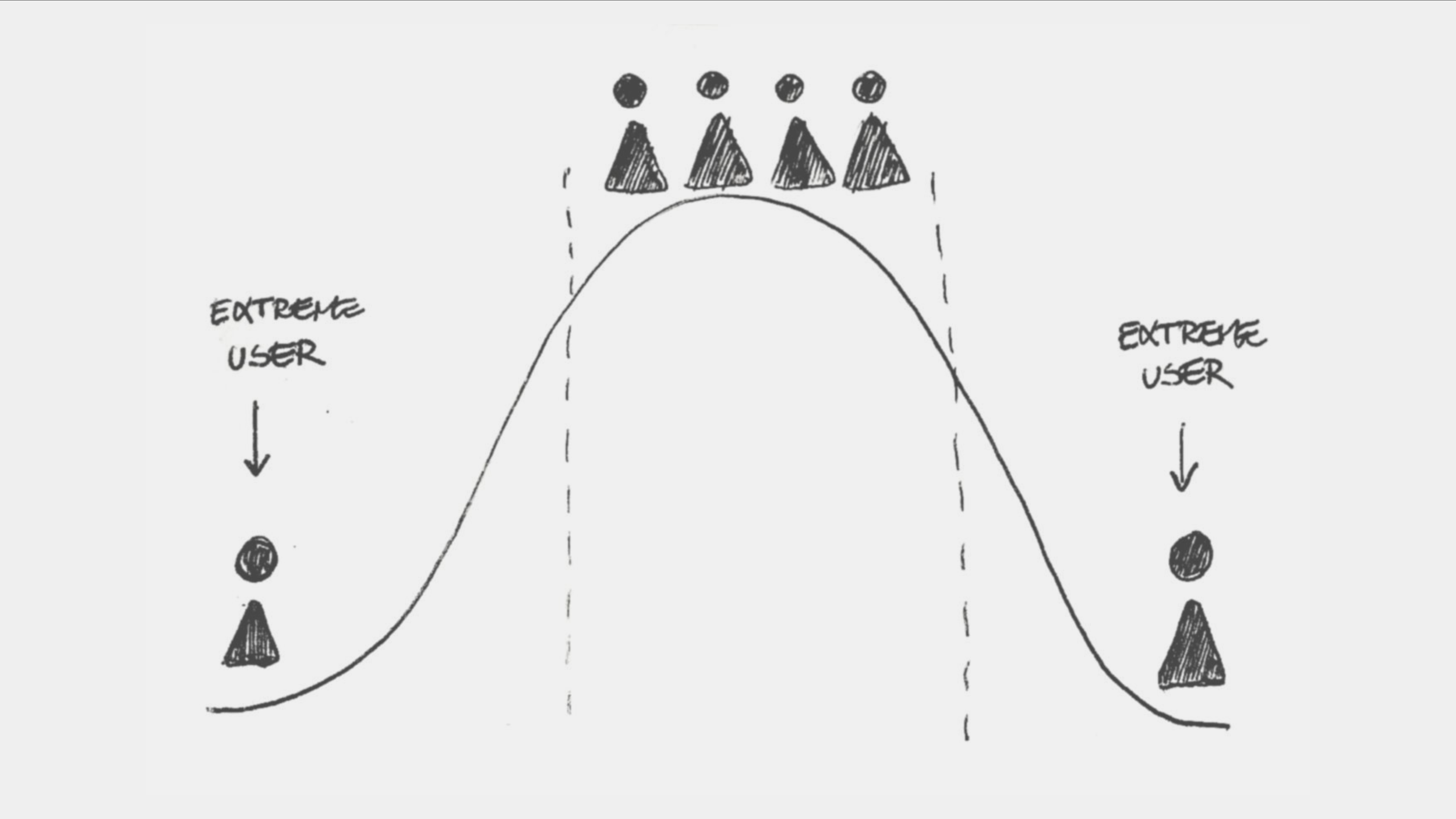
I believe that the inspiration that can drive product innovation and evolution aren’t always found with mainstream users with traditional behaviors. Sometimes you have to look to the edges—for more edge-like behaviors and mindsets—because they can shine a light on the needs that most of the population can’t articulate, even if they are there for everyone.
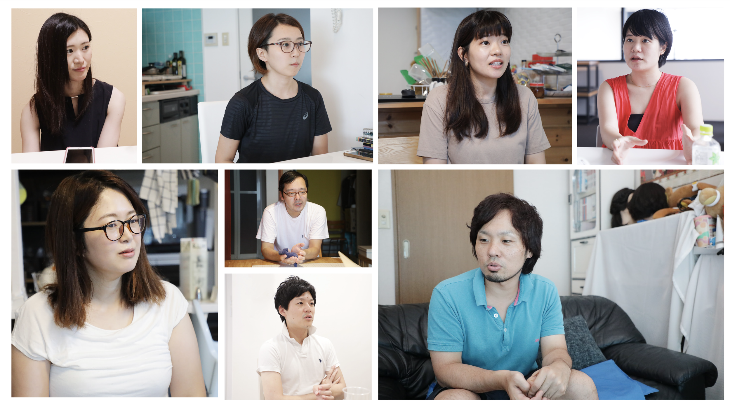
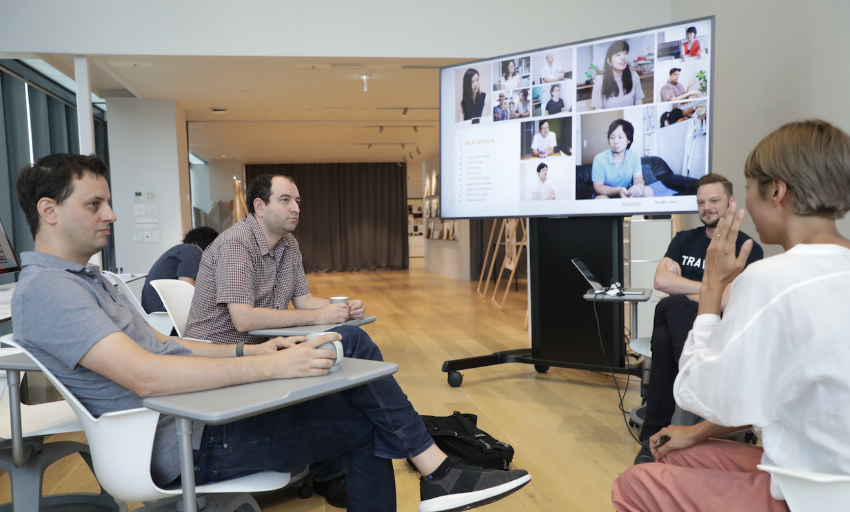
For this work, we spoke to a luxury hotel hopper, a foodie traveler, local culture diggers, spontaneous travelers, a detail-oriented planner, even a mystery tour guide. We also shadowed several users through their booking and travel experiences. We shadowed...


...a travel-blogging family of three, who were currently travelling across Japan in a van, booking accommodations as they went...
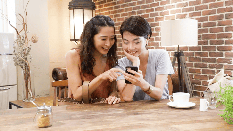
...and a duo of Japanese Instagram influencers, who post their travel adventures to thousands of followers. For them, booking the right hotel was not only important to them, it was important to the experience of their followers as well.
Through our research, five themes seemed to come up over and over again.
Let’s unpack one of them...
“Japanese travelers pride themselves on their idiosyncratic travel needs.”
Seemingly, everyone has something they are unwilling to compromise when it comes to booking the right hotel. For example:

Mana-san who is a mom of young child said, “I always search for information about amenities in the review section before booking. I want to see whether they have an all-in-one shampoo, or if shampoo and conditioner are separated.”
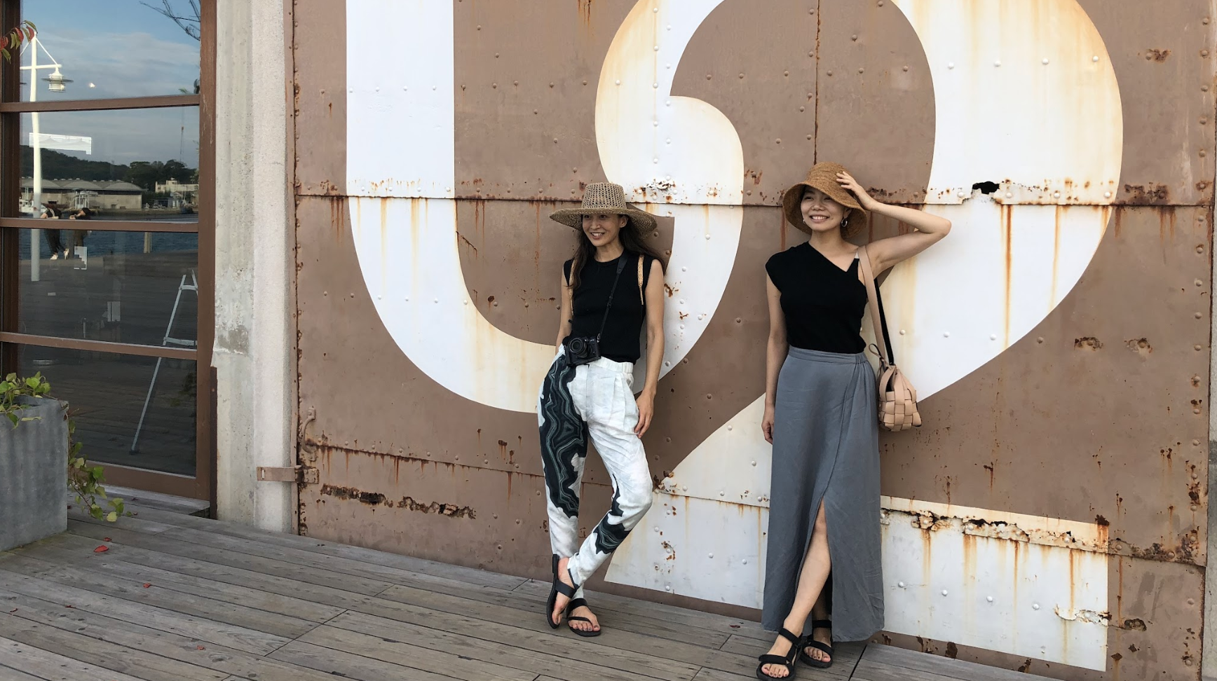
And Eri and Mio, our Instagram influencers, said, “We always check whether there are some organic restaurants around the hotel. If there is, this adds another vote to stay at this hotel.”
And Michi-san told us: “I always need to know if the hotel’s WiFi is in-room or not.” This is because many hotels in Japan only have WiFi in public spaces.
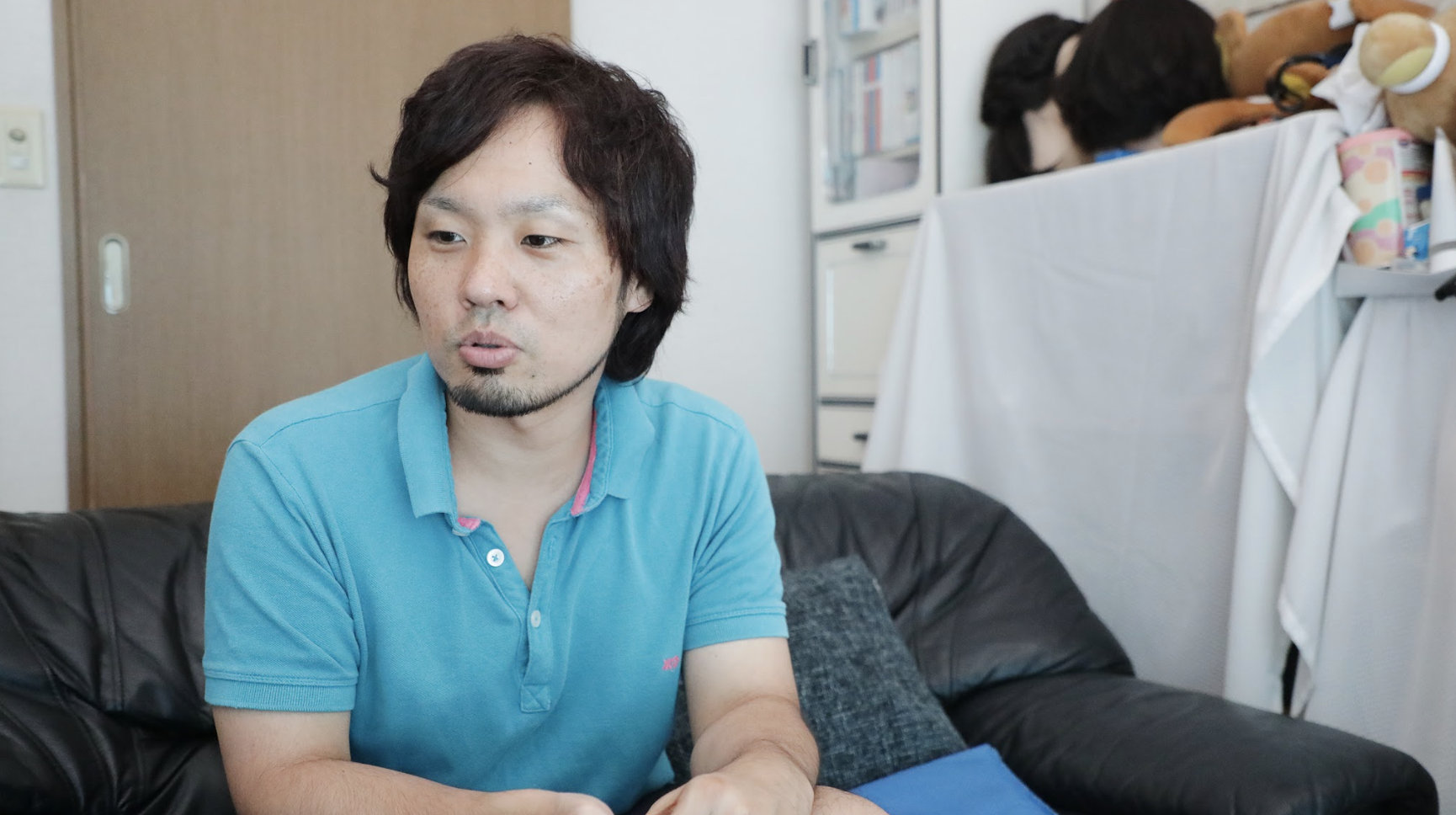
Ryo san said, “When I book a hotel for a business trip, I always check whether a toilet and a bath are in the separated room or not.” (If you’ve ever been to Japan, you know that often the toilet has a dedicated space.)
Everyone seemed to have very unique and very specific qualities they were looking for in a hotel, many which were not captured in Google’s structured data on properties. From an ethnographic lens, this quality of answering to very detailed needs did strike us as cultural. As I learned from my Japanese colleagues on the project: In a country where 98% of the population is from a single ethnic group, people here expect others to act, think, see in the similar ways. That is one of the reasons why the small needs could actually be a big differences in Japan.

Customizing Ramen is a good example of this mindset expressing itself. You can customize the small details like thickness of the broth, spiciness, softness of the noodle, and topping to have the ramen as you like.
“I have priorities within the requirements I put as a filter. If I care about price and the room type, I want the system to ask me which one has more priority.”
I hope in hearing some of these quotes, you’re getting the sense that people are looking for a lot of information and a lot of control throughout their decision making process.
But this ability to actively serve the needs of the user and navigate her to satisfaction is actually alive and well in Japan outside the world of digital products. It is embodied in the Japanese concept of Omotenashi.
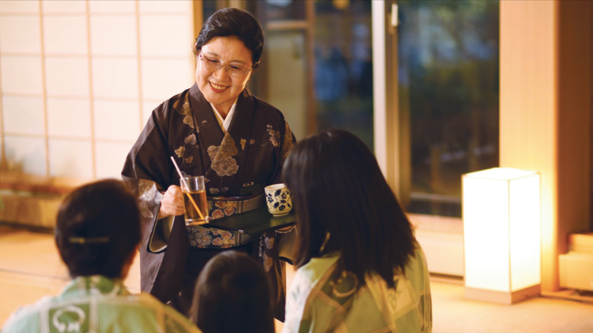
Omotenashi is the service philosophy of anticipating the needs of customers and answering them before customers even ask.
For example, at a ryokan (a traditional Japanese inn), there is always someone called Nakai-san who is actively seeking for the customer’s detailed needs and wants so that customers do not have to initiate the conversation. They are able to communicate their needs passively. This led us to the question...
“What would Omotenashi for Google Travel look like?”
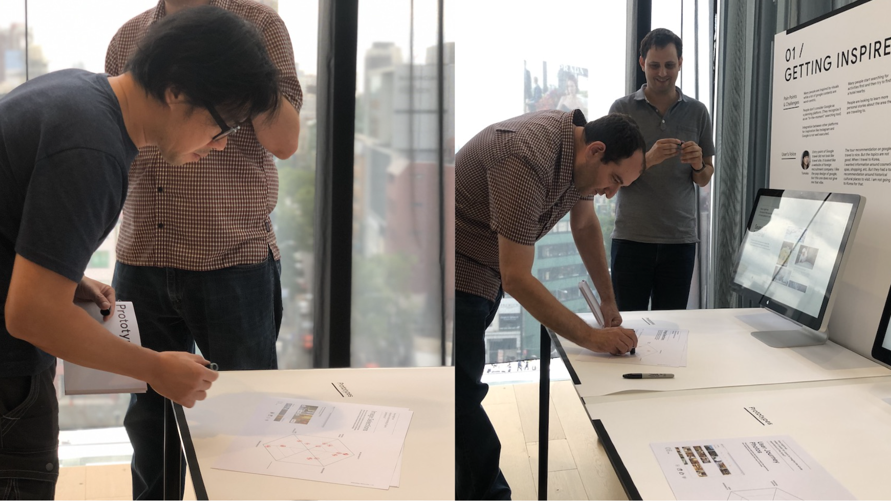
Well, really there is only one way to find out. We prototyped it.
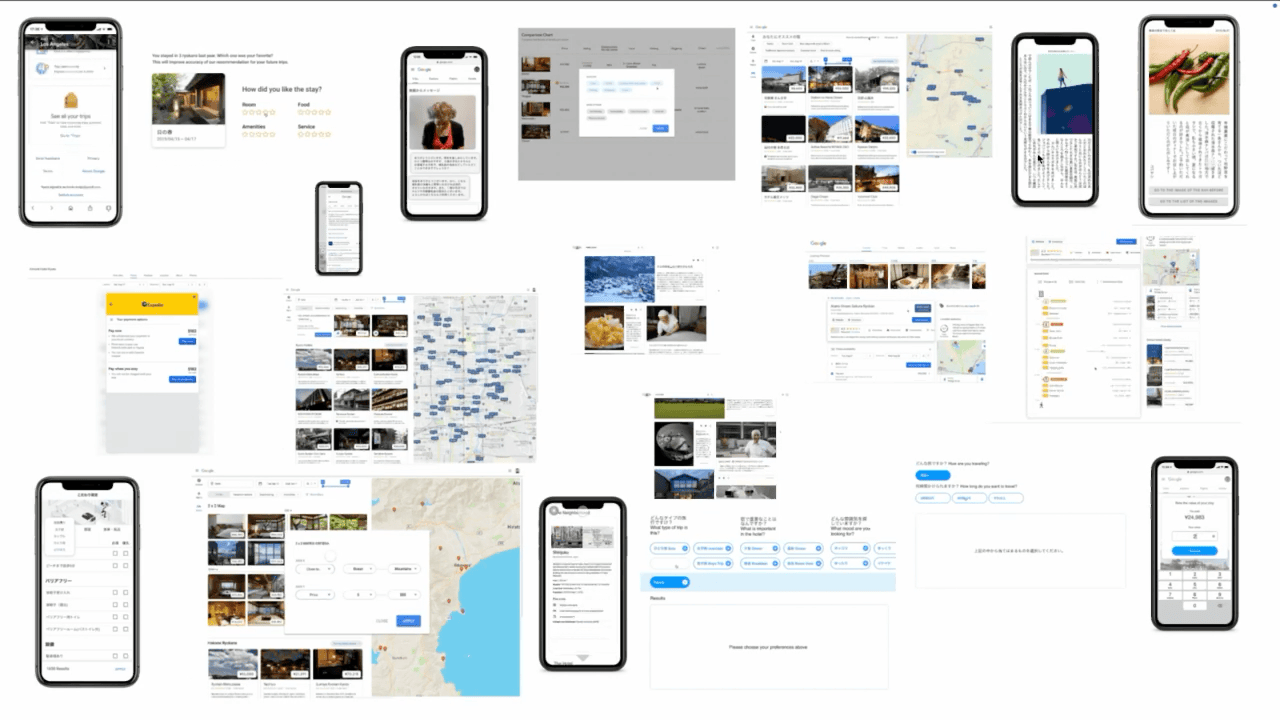
We went broad and thought about all the various features, formats components and presentation layers we could use to help people narrow in on their detailed and specific needs without putting too much of the burden on them.
We flew some of the Travel PMs and Directors out to Japan...

...shared our prototypes...
...and gave them Hanko, the stamps a Japanese business person uses to sign documents. Each was assigned a Japanese surname for their hanko, for example Rudi, our creative lead on the left was given Takahashi (“high bridge”) because he lives in New Jersey and crosses the bridge every day to work in the New York office.

They rated 23 prototypes with their hanko across vectors like scalability to other markets, alignment with the long term strategy, and speed to implementation.
And then, of course, we showed them to users. By using the prototypes as prompts for discussion, we started to see aspects of traveling and ways of organizing information that we didn’t think of before.
When we looked into it, Ryo (the user who wanted a separate toilet and shower) wasn't the only one looking for that information. Others had commented about it in Reviews. That led to the idea of being able to search over Reviews for insights not usually found in hotel attributes (coffee maker, tv, etc.). It is from within that tension “why is separate toilet so important” to “how do you even show that” that we ended up with a novel and innovative idea—one that eventually led to a tech patent.
Here are just a few snapshots of UX recommendations we made related to this question:
“What would Omotonashi for Google Travel look like?”
First, an overview of the immersive page. Where we evolved some of the features like Filters to be more robust and structured.
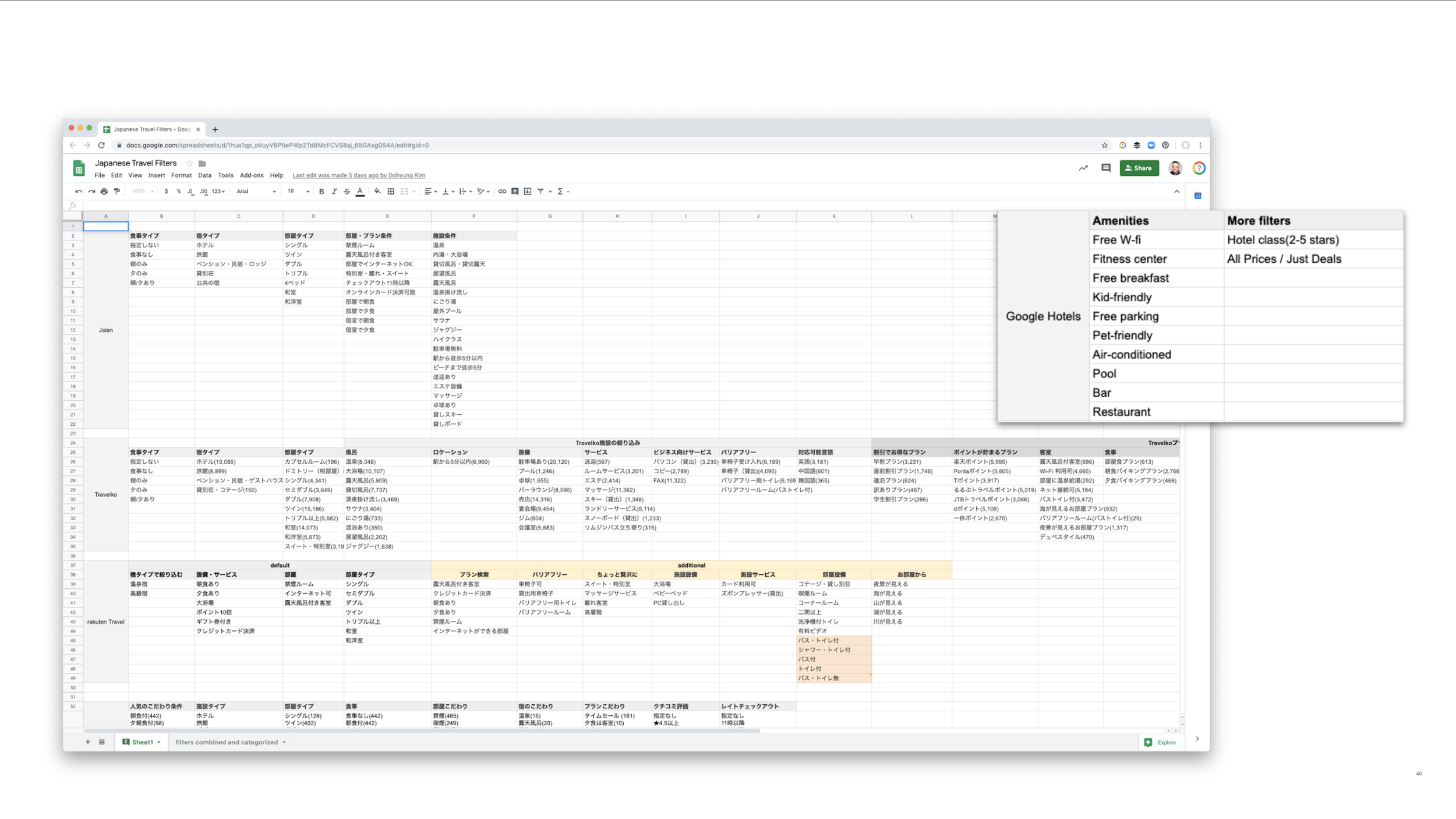
When we audited the filter categories for the top Japanese booking sites we saw they had as many at 100 filter categories. The current Google Travel product had 12.

To satisfy users’ detailed needs around hotel experiences, we suggested slightly more detailed options for filters. Yet, structured in a Googley way that keeps them from becoming overwhelming.
Filters are divided into categories for easier navigation: Location, hotel(hotel type & amenities), room(room type & options) and services.

Those categories then break down to specific filters the user can select from...

...and are presented as chips across the top of the Search Entry Point...

The chips read the category name. When selected, read the filter name, and when clicked, shows the filer list, providing enough options without being visually overwhelming.
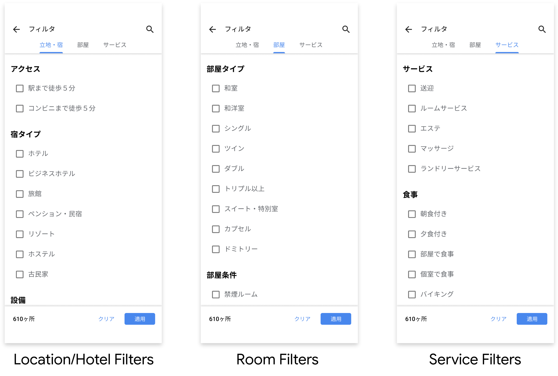
Filters in mobile version is presented whole screen, with the top navigation (Location/Hotel, Room and Service).
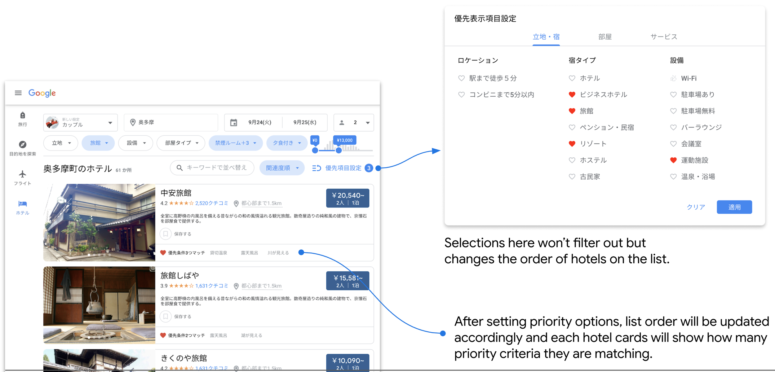
Another novel new feature is one we called Priority Setting, which enables users to prioritize hotels with more “nice-to-have” features they want. Selections here won’t filter out but changes the order of hotels on the list. After setting priority options, list order will be updated accordingly and each hotel cards will show how many priority criteria they are matching.

Sort by keyword is a new way to organize the hotel list. When users enter a keyword, Google finds the keyword in reviews and find the hotels with the most positive reviews around the subject. In this example, the user searched for the keyword “Kids”, and the list is reorganized by kid-friendliness of hotels, based on Reviews.
This idea of surfacing the right, detailed information about a property when Google might not have all the structured data for every property, led us to think about other ways, beyond Reviews, that we could do this for people.
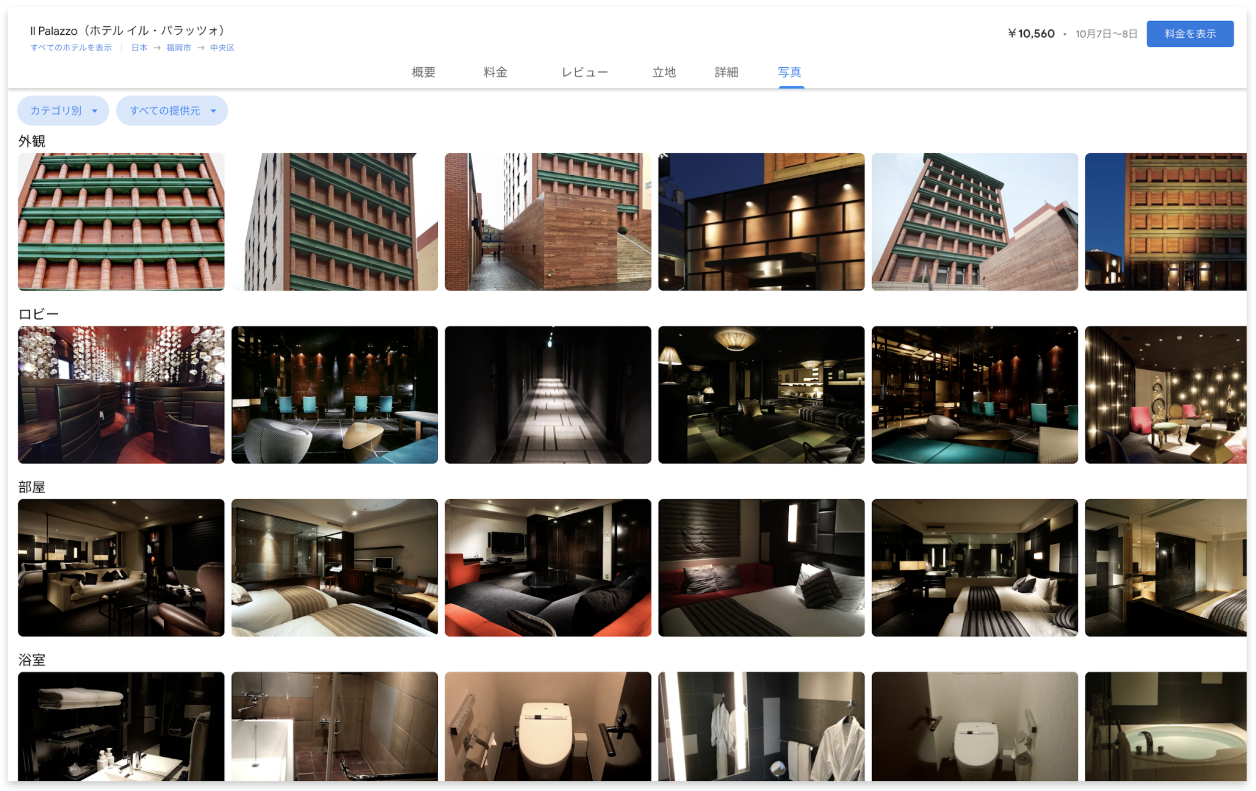
For instance, within the photos tab we can organize images into categories that might map to how the user might experience the hotel, beginning with the exterior, the lobby, the room, the bathroom and so on.
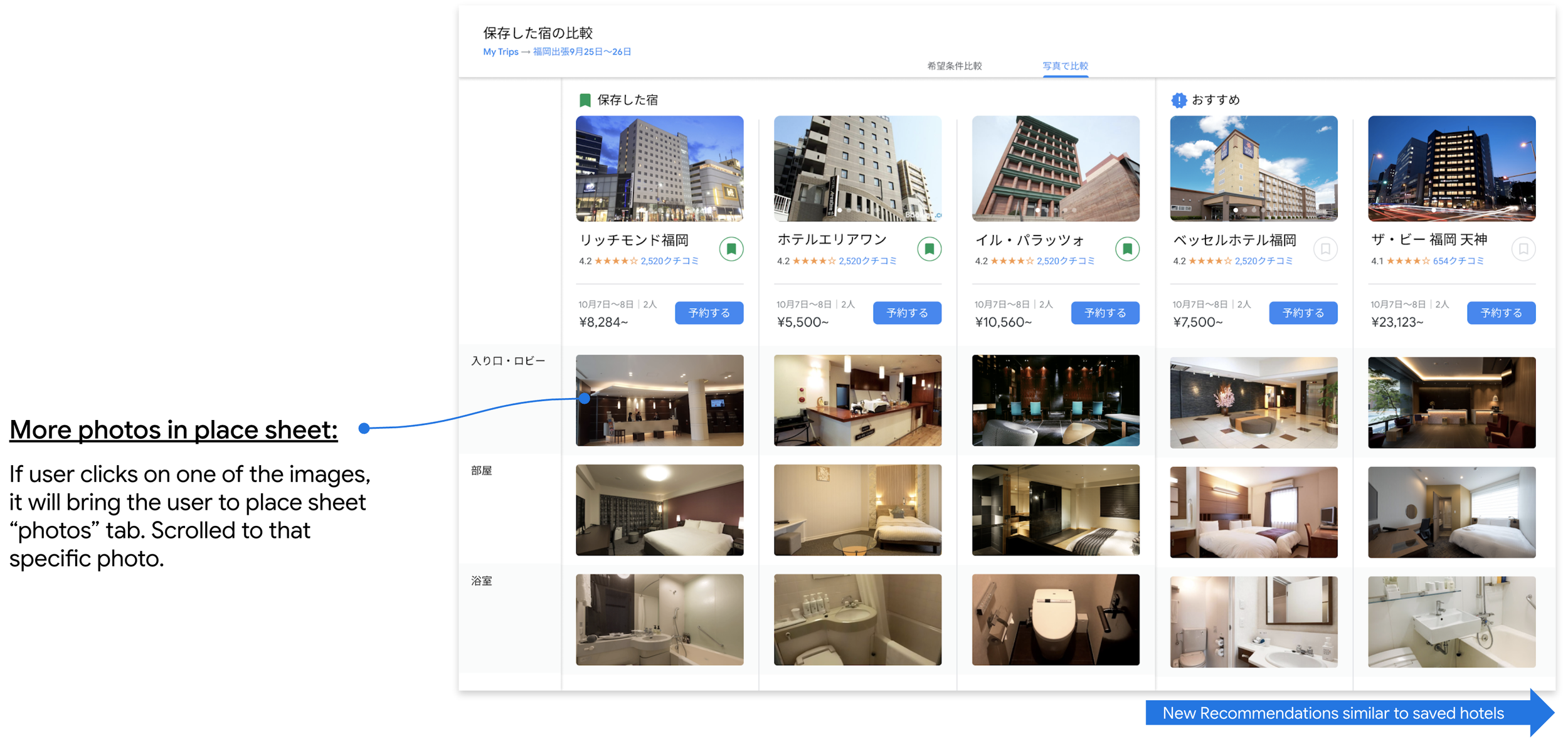
When comparing properties, users could even see photos of different categories for each hotel. For example, here our friend Ryo can visually see which toilets have a dedicated room and which are next to the tub.
Though Japan is a relatively small market for Google Travel, the insights and UX design recommendations are having an outsized impact on the global product. This is seen even in recent user metrics:
“We piloted this work in India, where Google saw a 177% increase in interactions and 119% jump in click through rates.”
The UX recommendations our team proposed might not be revolutionary, but they were powerful changes that impact people’s functional experience and maybe more importantly, their emotional experience of using Google in Japan.