Client: Wells Fargo (2011)
Making ATM interactions fast and easy—without requiring any new hardware
My Role: Project Lead & Design Manager
Wells Fargo, one of the United States’ largest banks, wanted to refresh and improve the experience at their thousands of ATMs.
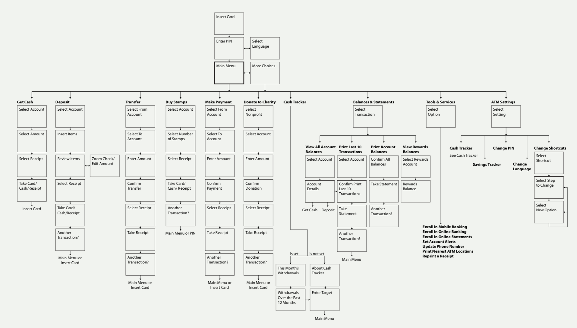
The updated interface needed to be different enough to have a tangible impact, and had to appeal to an extremely broad audience. What’s more, any changes made to the interface had to be compatible with the existing hardware of all of the ATMs in operation nationwide.
Leading this program, I collaborated with the Wells Fargo team to enhance the ATM user experience. We needed to create something that feels faster, easier, and innovative, but this had to be done without requiring any new hardware.
Starting at the kick-off workshop we established the goals of the redesign with core and extended Wells Fargo teams. To research current ATM experiences, we interviewed various types of ATM users, both Wells Fargo and non-Wells Fargo customers. We ran an online survey that explored general attitudes toward ATMs. We audited the current ATM interface, including a visit to Wells Fargo’s Learning Lab. We visited 28 other self-service touch-points including touch-screen kiosks and ATMs of other banks. We looked for inspiration in the landscape of finance-related digital interactions, including online banking, web-based utilities and smart-phone applications.
These studies and customer interviews led to the distilled list called “The ATM Mindset.” After sharing these findings with Wells Fargo we began exploring how the ATM interface could meet these needs.
“When I am standing in front of the ATM and have put in my code I feel very, vulnerable and I want to end the transaction quickly and go.”
“I don’t really notice or use anything or care about anything other than getting my cash and leaving.”
We brainstormed concepts and sketched a range of interfaces that could potentially improve the ATM user experience. After discussion with the Wells Fargo core and extended teams, we chose three promising directions. We built interactive prototypes to further explore our ideas at greater fidelity.
Tuned
What if the experience felt so tuned that users felt like the ATM knows just what they need?
Swift
What if the experience was so swift that users felt like an ATM ninja?
Transparent
What if the experience felt so transparent that people felt like the ATM made them smarter?
We took these prototypes into “sounding boards,” showing them to users with a range of attitudes and outlooks on financial and digital services, based on Wells Fargo customer personas. The sounding boards consisted of group discussions between the customers, Wells Fargo team members, and our team. We had people use play with the prototypes, which were housed in mock-ATMs, and then react in writing to each of the three directions.
As a team, we agreed that the Tuned direction best delivered on The ATM Mindset. The experience would be tuned in a way that may not be entirely apparent to the user, but the resulting experience should feel simpler and speedier, and more guided than other “un-tuned” interactions.
We decided we would “tune” the experience in two ways:
1) Direct users to the options they use most often
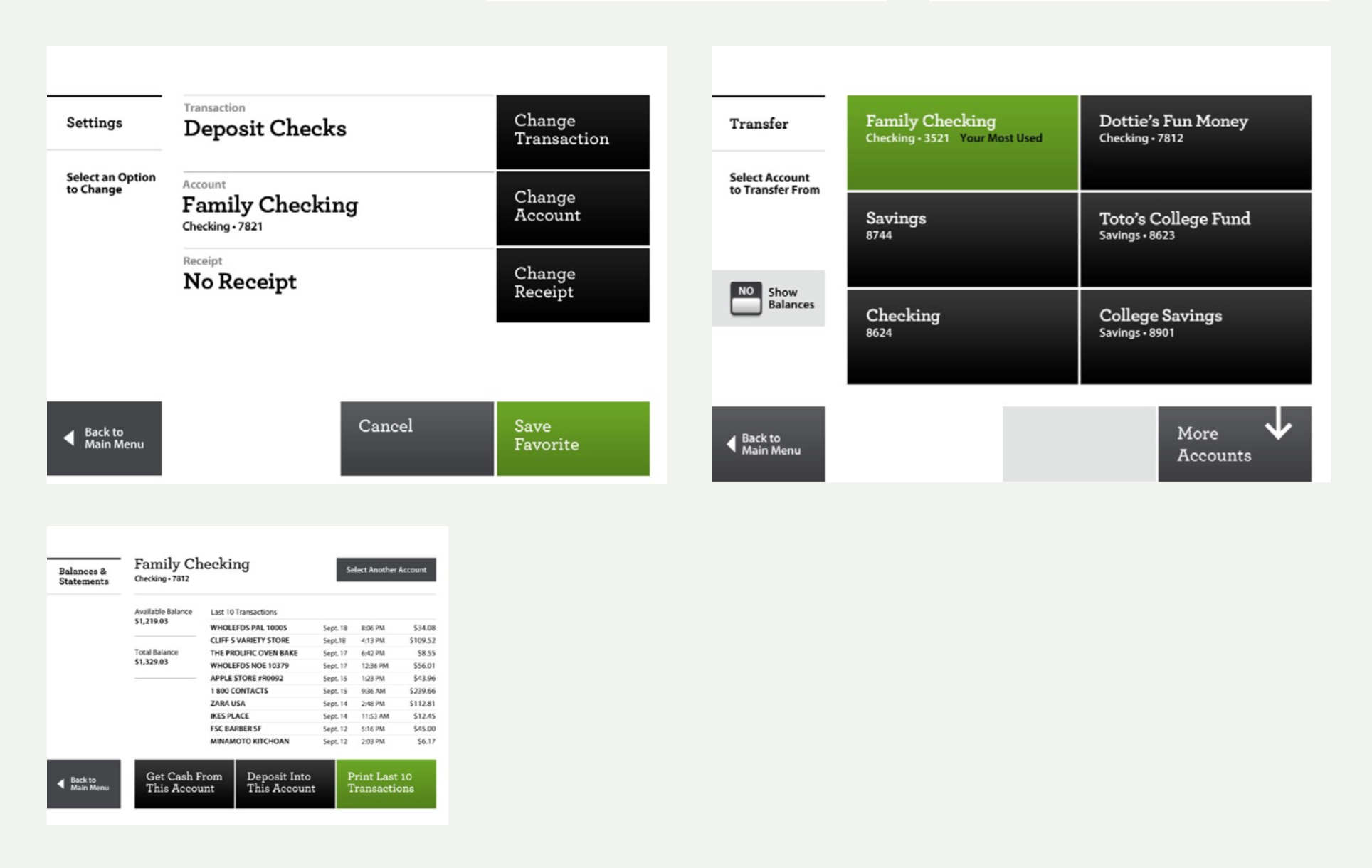
On the Main Menu the most used transactions are collapsed into two large green favorite or shortcut buttons. This allows the user to press one button to instantly execute the transactions they do the most. On other screens the most-used option is often highlighted in green and labeled “Your Most Used.” The color and label attract the user’s attention and quickly guides them to the option they are most likely to choose while not limiting them to only that option.
2) Move infrequently used options to a secondary screen
The second way we tune the interface is to remove options the user has shown they are unlikely to use. On the Main Menu only options used within a recent number of visits are shown. This means users who use the ATM for a limited number of functions get a simpler interface, while users who take advantage of many of the ATM’s capabilities get a more advanced interface.
The interface’s entire layout is personalized, based on what a user does most at the ATM. It gives users an immediate glance at their account balances (which they can also hide) and highlights the touch screen 'buttons' that they use most (by putting them at the top of the screen in green). New data hierarchy also facilitates skimming for fast decision-making and provides messages and notifications based on a customer’s priorities.
The implemented design launched to all Wells Fargo ATMs in 2012.
“[The design] shows an intense attention to detail.”
“Most ATMs nowadays have areas that the user can customize but really aren’t worth the time you’d put in doing that. This new interface runs noticeably smoother than others and required zero upgrades to over 12,000 of the pre-existing ATMs around the nation.”


